Revamp the UX/UI design of Discover introducing a new sidebar, enhanced graph area, enhanced table section using a powerful component from our design system (EuiDataGrid) and new responsive mode.
For this stage I focused on learning about:
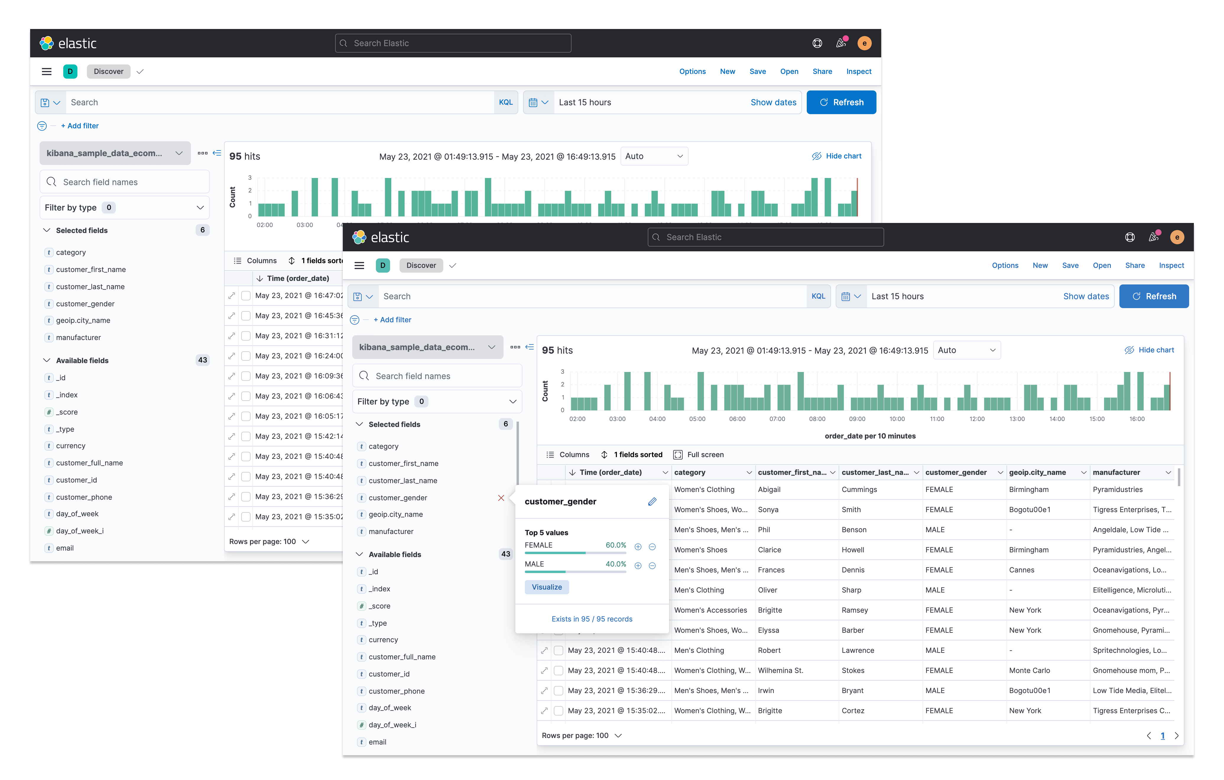
The push for the revamp of Discover started when a new table component (EuiDataGrid) was released in our design system. EuiDataGrid would solve a lot of the existing table problems, including allowing for column reordering and adjusting columns’ width. However, the introduction of EuiDataGrid would also mean that certain content would need to be relocated as it could no longer be included in the table. Since we were redesigning the table we thought we could also take the opportunity to improve the rest of Discover. So this is what I set out to do.
At Elastic, my role is designer who codes which means I submit pull requests directly to the GitHub repo whenever I want to implement some changes in our product. My design manager suggested that I took an incremental approach to this revamp and that I did micro-redesigns of the application by splitting my work into multiple pull requests. This would make it easier to review and keep track of my proposed changes.
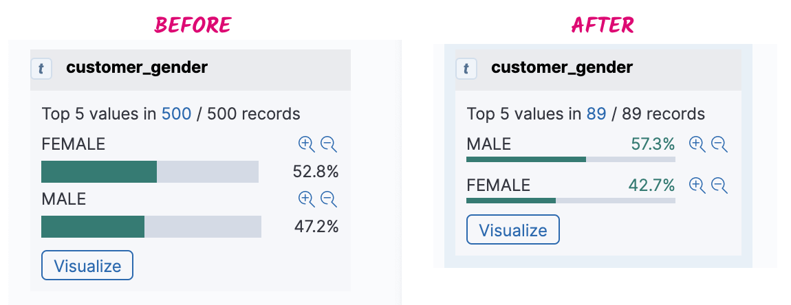
I decided that my first micro-redesign would be to try and clean up the little graph that appeared upon expanding a field on the sidebar (i.e. the field preview). I thought the graph bars were too thick for an area that was already packed with content so my first change was to improve the UI design of this view.
Next, I implemented wrapping of the field’s name on the sidebar which is something users had been asking for. I also improved the styling of the field when active.
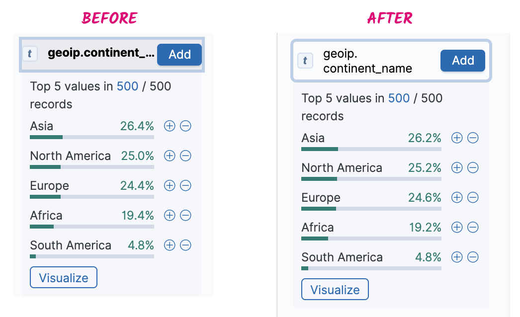
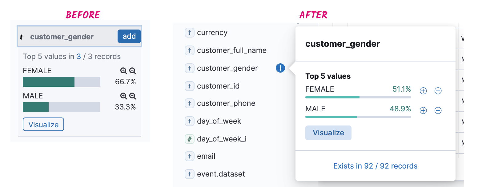
These were nice improvements but I wanted to improve the sidebar even more. I decided to explore options so that the sidebar’s height would remain the same at all times. This meant showing the preview of the field outside the sidebar. I decided to show the field preview in a popover as that was a pattern that was working well elsewhere in Kibana.
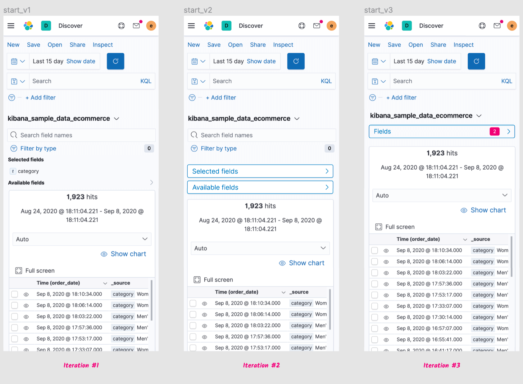
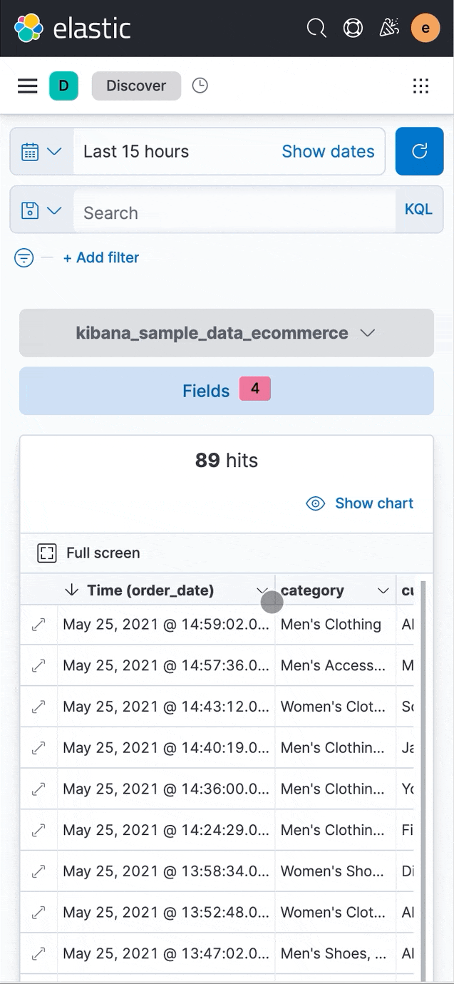
Discover is one of the first Kibana applications that gets a mobile view. While Kibana is not meant to be used on mobile for now, I wanted to provide a usable experience on mobile. Discover has two main sections: the sidebar and the table. I decided that it would make sense to have a compact view of the sidebar on mobile which is why I started exploring options to make this happen. These were my iterations:
Before the “Expanded document” section would appear upon collapsing a table row. The way the new table component works meant that I’d have to find a new location for this content. I decided to place it on a flyout because this would allow us to show the user the details of a document without pushing all the other documents (i.e. the rows below the selected row) down.
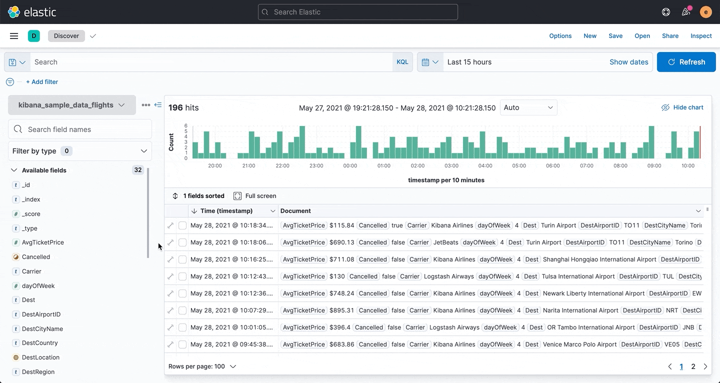
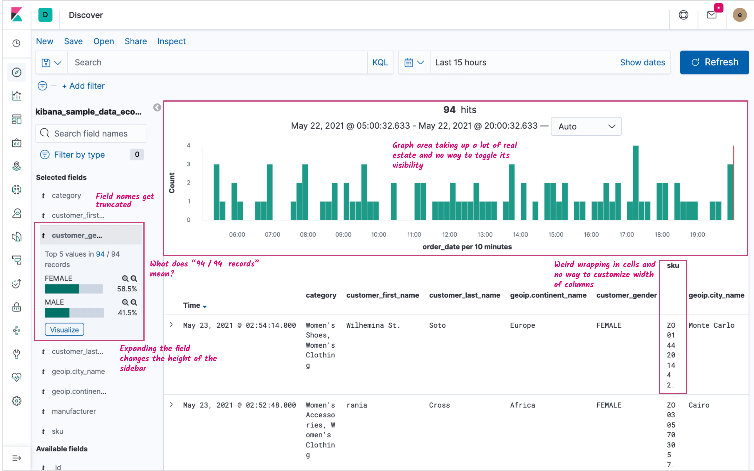
Discover is an application packed with content. The old version had a graph area that was taking up a considerable amount of the screen. I reorganized the elements in this area and reduced the graph size to reduce the height of this section. I also added the possibility to toggle the graph's visibility.
As Discover is a widely used app within Kibana that hadn’t undergone any major changes we thought it would be a good idea to validate the new UI with existing users. For this reason I used UX Labs which is a pool of customers that have expressed their desire to take part in UX research. I designed a usability session where customers would perform common tasks such as creating a table by adding fields, removing fields, sorting and looking for specific information.
I then conducted these sessions over Zoom where I was running the new Discover locally and I would give mouse control to the testers so that they could try and perform the tasks. Overall our testers were pleased with the new Discover but they did point out a couple areas of opportunity to put in our radars.
The first was that with the new Sort feature (which is included as part of the new table) users had a hard time realising that adding a new sort would not remove or override the existing one(s). By default the table is always sorted by the timestamp field.
The second was the column reordering feature, also included as part of the new table. Testers indicated that while it was nice to be able to quickly reorder columns by dragging and dropping they would also like to be able to reorder columns from the “Selected fields” list on the sidebar.
As I was also contributing to the code on this project there was no form of traditional handoff to developers, instead I submitted several PRs and added commits to larger ones authored by engineers on the team. Most of the features I described above have already been released, namely the new update sidebar with and the updated chart area.
The other major change coming to Discover is the new table. This is already available to users under a flag in Advanced Settings. Having the new table under a flag allows us to keep collecting user feedback and refining things before turning the new table on by default.