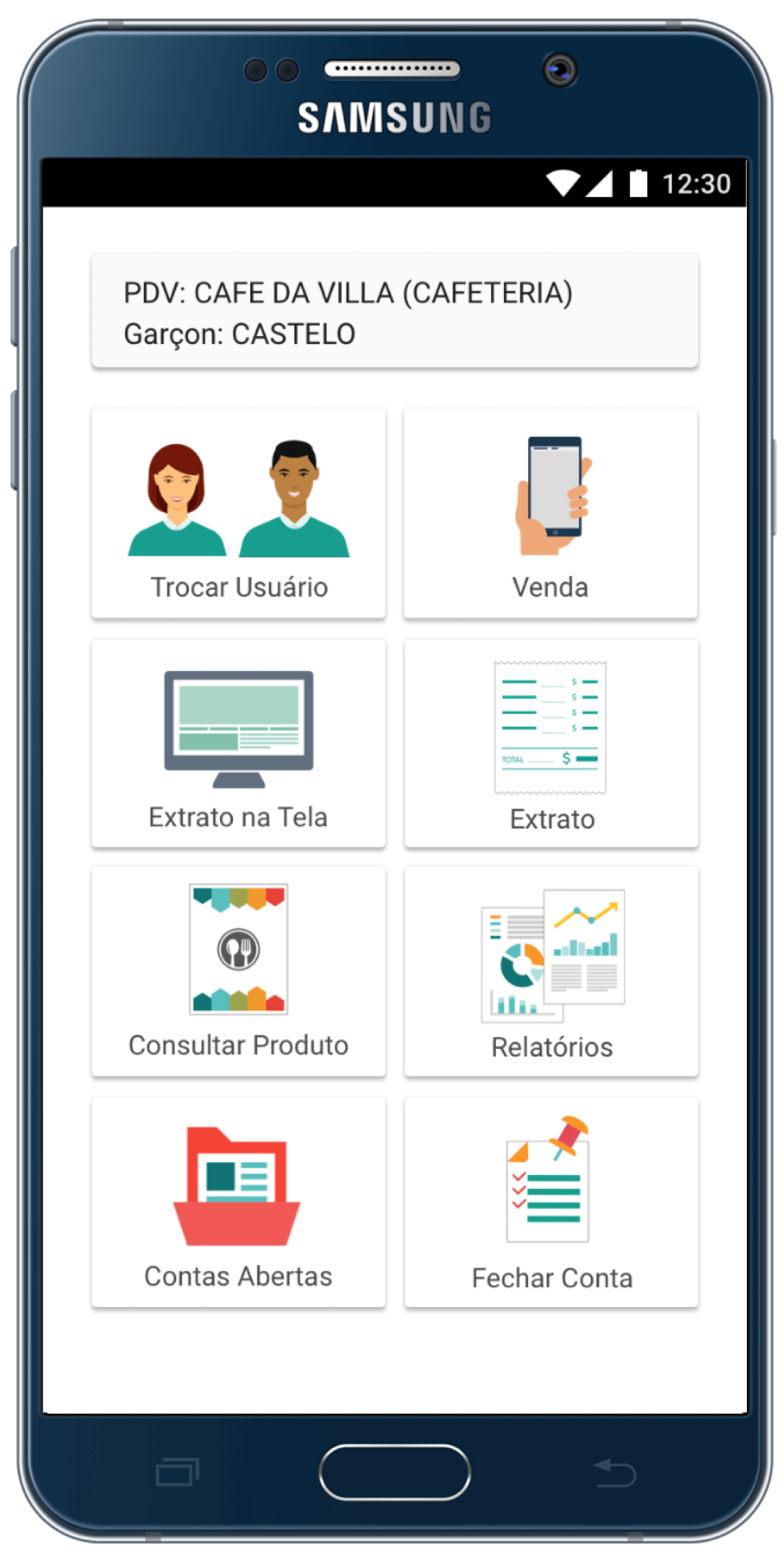
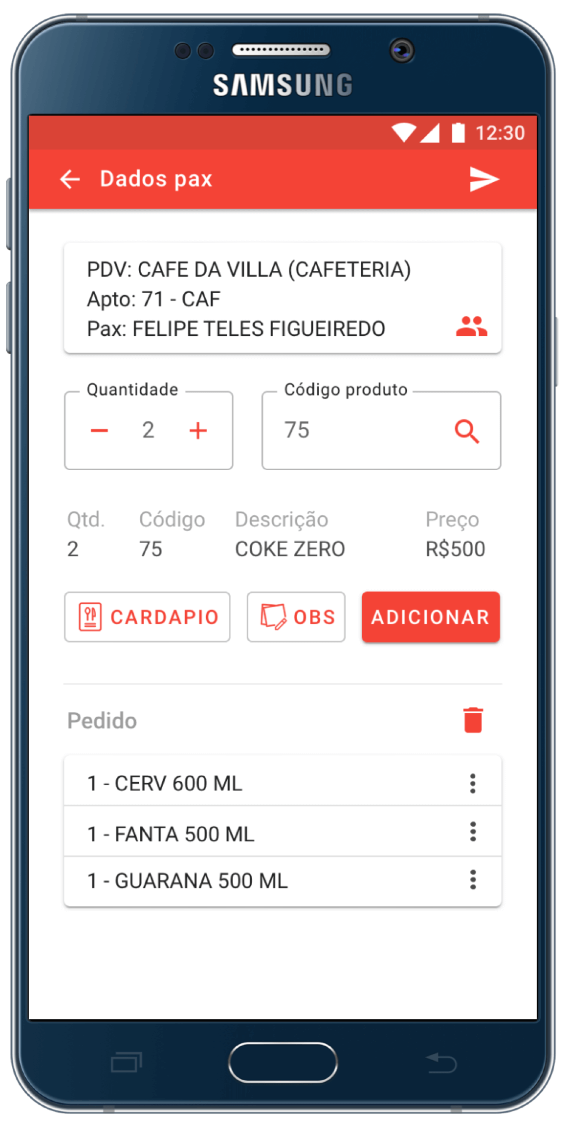


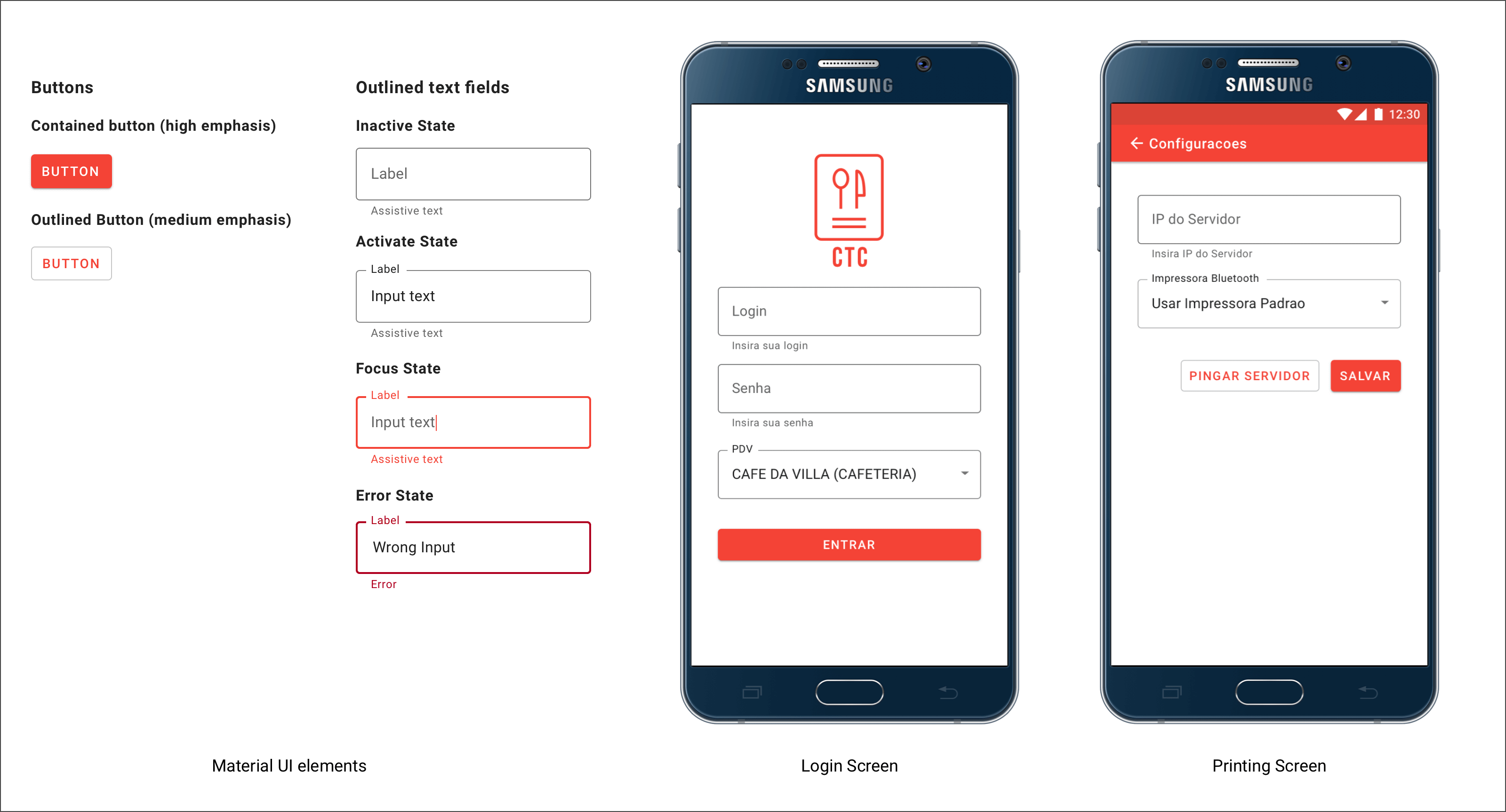
In order to achieve a clean design, I decided to use Google's Material Design. The main elements used were buttons, text fields and cards.
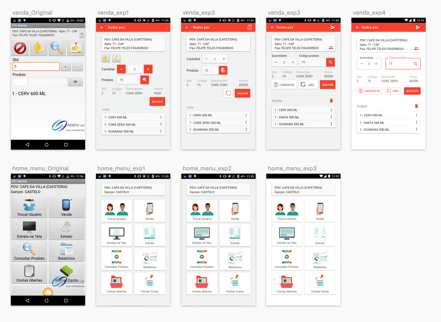
Below you can see some of my design iterations as I redesigned the main screens of CTC.
The logo was redesigned. It went from being a cashier printing a receipt to being a restaurant menu. This menu represent food orders which is the primary unit on CTC, servers generate orders and after they generate the corresponding receipts. The style of the new logo is flatter to better match current design trends as well as the Android UI.
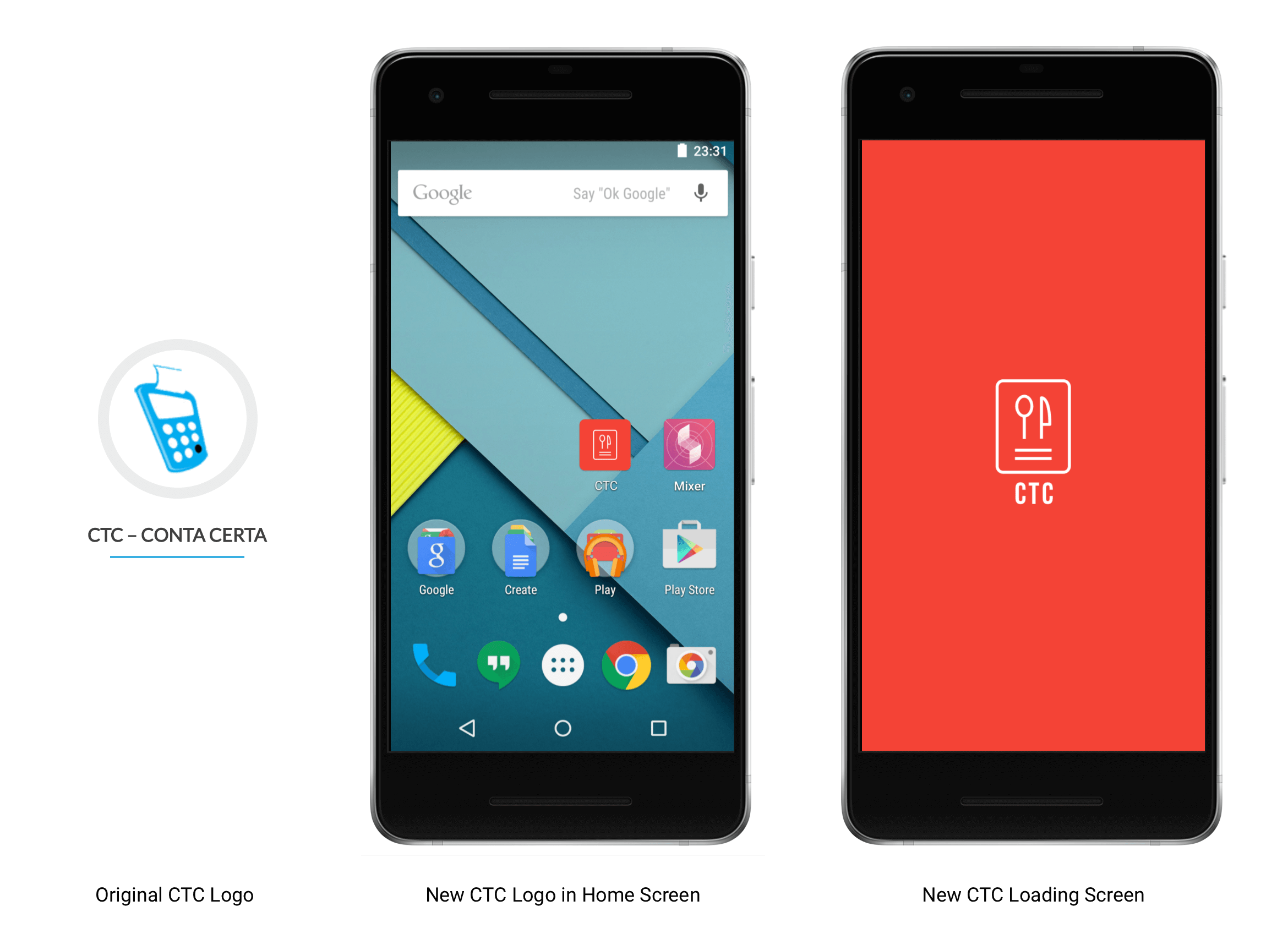

I delivered high-fidelity mockups, illustrations and icons for the Android application.
Due to resources constraints, the scope of this project was limited to improving the user interface. If I were to continue working on CTC, my next step would be to improve the user experience of the application.